Classes
Happy React feedback widget is built with easy customizing in mind. You can change the styles of every part of the widget. Also, the feedback widget comes with a default theme but you don't need to use it.
This powerful set can let you build easy feedback widgets but also don't get in your way in the process.
Every part of feedback widget have it's own name. These name are:
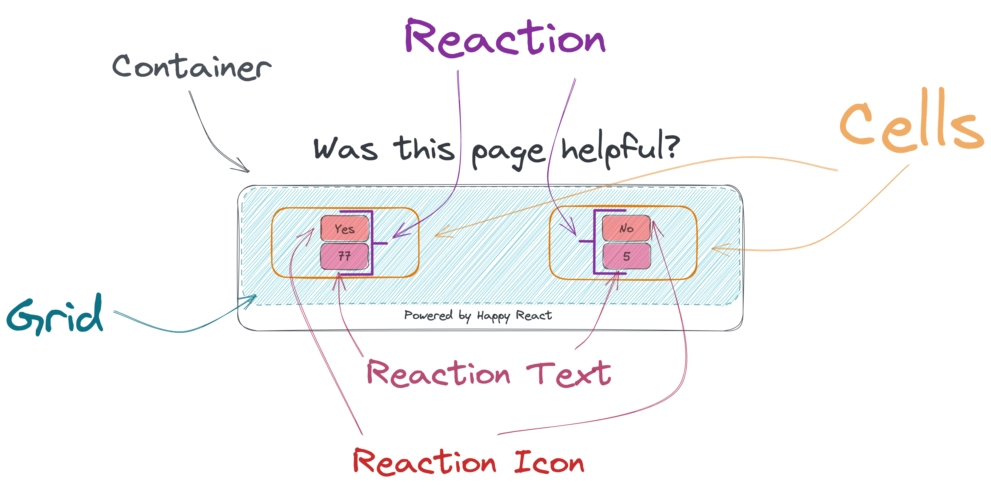
- Container
- Grid
- Cell
- Reaction
- Reaction Icon
- Reaction Text
Default theme
Depending of your application setup you should have ability to import css file.
See where theme.css file is loacted in framework you are using.
import "@happyreact/react/theme.css";Code
.hr-container {
  display: flex;
  flex-direction: column;
  font-family: Helvetica, sans-serif;
  color: var(--hr-container-color, inherit);
  background: var(--hr-container-background, transparent);
}

.hr-grid {
  display: grid;
  grid-template-columns: repeat(auto-fit, minmax(280px, max-content));
  grid-auto-rows: 1fr 1fr;
  justify-content: center;
  align-items: center;
  flex-direction: column;
  width: 100%;
  min-height: 150px;

  color: var(--hr-grid-color, inherit);
  background: var(--hr-grid-background, transparent);
  gap: var(--hr-grid-gap, 15px);
}

.hr-cell {
  display: flex;
  height: auto;
  justify-content: center;

  color: var(--hr-cell-color, inherit);
  background: var(--hr-cell-background, transparent);
}

.hr-loader {
  display: flex;
  align-items: center;
  justify-content: center;
  width: 100%;
  height: 150px;
}

.hr-reaction {
  background: none;
  display: flex;
  flex-direction: column;
  align-items: center;
  cursor: pointer;

  color: var(--hr-reaction-color, --hr-default-color);
  background: var(--hr-reaction-background);
  border: var(--hr-reaction-border);
  border-radius: var(--hr-reaction-border-radius);
}

.hr-reaction:hover {
  color: var(--hr-reaction-hover-color, --hr-default-color);
  background: var(--hr-reaction-hover-background);
  border: var(--hr-reaction-hover-border-);
  border-radius: var(--hr-reaction-hover-border-radius);
}

.hr-reaction:active {
  color: var(--hr-reaction-active-color, --hr-default-color);
  background: var(--hr-reaction-active-background);
  border: var(--hr-reaction-active-border);
  border-radius: var(--hr-reaction-active-border-radius);
}

.hr-reaction-icon {
  display: flex;
  justify-content: center;
  align-items: center;
  width: 30px;
  height: 30px;

  color: var(--hr-reaction-icon-color, --hr-default-color);
  background: var(--hr-reaction-icon-background);
  border: var(--hr-reaction-icon-border);
  border-radius: var(--hr-reaction-icon-border-radius);
}

.hr-reaction:hover .hr-reaction-icon {
  color: var(--hr-reaction-icon-color-hover, --hr-default-color);
  background: var(--hr-reaction-icon-background-hover);
  border: var(--hr-reaction-icon-border-hover);
  border-radius: var(--hr-reaction-icon-border-radius-hover);
}

.hr-reaction:active .hr-reaction-icon {
  color: var(--hr-reaction-icon-color-active, --hr-default-color);
  background: var(--hr-reaction-icon-background-active);
  border: var(--hr-reaction-icon-border-active);
  border-radius: var(--hr-reaction-icon-border-radius-active);
}

.hr-reaction-text {
  margin-top: 10px;
  padding: 5px;

  color: var(--hr-reaction-text-color, --hr-default-color);
  background: var(--hr-reaction-text-background);
  border: var(--hr-reaction-text-border);
  border-radius: var(--hr-reaction-text-border-radius);
}
.hr-reaction:hover .hr-reaction-text {
  color: var(--hr-reaction-text-color-hover, --hr-default-color);
  background: var(--hr-reaction-text-background-hover);
  border: var(--hr-reaction-text-border-hover);
  border-radius: var(--hr-reaction-text-border-radius-hover);
}

.hr-reaction:active .hr-reaction-text {
  color: var(--hr-reaction-text-color-active, --hr-default-color);
  background: var(--hr-reaction-text-background-active);
  border: var(--hr-reaction-text-border-active);
  border-radius: var(--hr-reaction-text-border-radius-active);
}

.hr-reaction-active {
  color: var(--hr-reaction-text-color-active, --hr-default-color);
  background: var(--hr-reaction-text-background-active);
  border: var(--hr-reaction-text-border-active);
  border-radius: var(--hr-reaction-text-border-radius-active);
}

.hr-powered-by {
  display: block;
  margin-left: auto;
  margin-right: auto;
  text-decoration: none;
  color: inherit;
}
.hr-powered-by:hover {
  text-decoration: underline;
}
Global CSS
Every part of feedback widget have it's own class. It start with hr- and next part it's the name
of where it's applying. Example: hr-container or hr-reaction-icon. You can modify styling by including
global css with these classes.
Make sure to wrap widget with your class name and use it to style happy react feedback widget. With this
you increase specifity and you won't need !important to override styles.
.my-widget {
}

.my-widget .hr-container {
}
Assigning local classes
When you built your application you probably deal with styling. It's not matter if you use CSS Modules (opens in a new tab) or Tailwind (opens in a new tab) you can use them to style widget. You can pass object of names and corresponding classes.
<Widget
  classes={{
    container: '',
    reactionIcon: ''
  }}
/>
Required: No
Type: string | { root?: string; container?: string; grid?: string; cell?: string; reaction?: string; reactionActive?: string; reactionIcon?: string; reactionText?: string; }
Default: none