Integrating with Next.js
Install Next.js
According to official documentation (opens in a new tab) of installing next.js using create-next-app (opens in a new tab):
npx create-next-app@latestthen you will be asked bunch of questions what tools you want to use. After that, you can run your application.
npx run devInstall package
HappyReact provides React package to install from the npm registry. This will let you add more control over how you load the feedback widget. For example, you can defer loading it to have a better web vitals score.
npm install @happyreact/react Project setup
Create a new project in the dashboard
Go to New project (opens in a new tab) and choose the name of the project eg. Docusaurus. You can always change it later.
Add two reactions: "Yes" and "No"
Go to the Docusaurus project > Reactions tab. Click in "+ Add new reaction" and fill the "Icon" input with Yes.
Remove $count text from the "Label" input.
After that, make same steps with No reaction.
Adjust project settings
Every domain where you will use the feedback widget needs to be on the whitelist. This applies also to development and staging
domains. Make sure you include port in localhost domain eg. http://localhost:3000.
Mark the option "Allow multiple reactions" and set the "Max reactions" to 0 in settings.
Let's make our feedback component
Now we need to adjust our Feedback code:
import React, { useState } from 'react';
import { Widget } from '@happyreact/react';

import '@happyreact/react/theme.css';

const VotedYes = () => {
  return <span>Thanks for your feedback. We are glad you like it :)</span>;
};

const VotedNo = () => {
  return <span>Thanks for your feedback. We will try to improve :(</span>;
};

export default function Feedback({ resource }) {
  const [reaction, setReaction] = useState(null);

  const isReacted = reaction === 'Yes' || reaction === 'No';
  const _resource = String(resource).replace(/\//g, '-');

  const handleReaction = (params) => {
    setReaction(params.icon);
  };

  return (
    <div>
      <h3>Was this page helpful?</h3>
      {!isReacted ? (
        <div>
          <Widget
            token="[token]"
            resource={_resource}
            onReaction={handleReaction}
          />
        </div>
      ) : reaction === 'No' ? (
        <VotedNo />
      ) : (
        <VotedYes />
      )}
    </div>
  );
}Make sure you replace [token] with created project token
Add our created feedback component on the bottom of every page. Unlike, for example in docusaurus you need to manually add component at every documentation page.
import Head from 'next/head';
import Feedback from '../components/Feedback';
import styles from '../styles/Home.module.css';
export default function Home() {
return (
<div className={styles.container}>
<Head>
<title>Create Next App</title>
</Head>
<main className={styles.main}>
<h1 className={styles.title}>
Welcome to <a href="https://nextjs.org">Next.js!</a>
</h1>
<p className={styles.description}>
Get started by editing{' '}
<code className={styles.code}>pages/index.js</code>
</p>
<div className={styles.grid}>
<a href="https://nextjs.org/docs" className={styles.card}>
<h3>Documentation →</h3>
<p>Find in-depth information about Next.js features and API.</p>
</a>
<a href="https://nextjs.org/learn" className={styles.card}>
<h3>Learn →</h3>
<p>Learn about Next.js in an interactive course with quizzes!</p>
</a>
<a
href="https://github.com/vercel/next.js/tree/master/examples"
className={styles.card}
>
<h3>Examples →</h3>
<p>Discover and deploy boilerplate example Next.js projects.</p>
</a>
<a
href="https://vercel.com/new?utm_source=create-next-app&utm_medium=default-template&utm_campaign=create-next-app"
className={styles.card}
>
<h3>Deploy →</h3>
<p>
Instantly deploy your Next.js site to a public URL with Vercel.
</p>
</a>
</div>
</main>
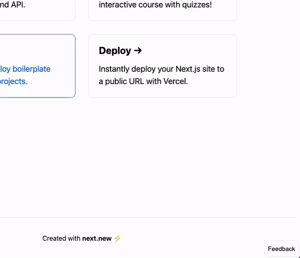
<Feedback resource="homepage" />
<footer className={styles.footer}>
<a href="https://next.new" target="_blank" rel="noopener noreferrer">
Created with <b>next.new</b> ⚡️
</a>
</footer>
</div>
);
}The result, for now, should be this:

It's not pretty but for now we don't care about styling. If you want feedback at the bottom you should check Nextra integration.
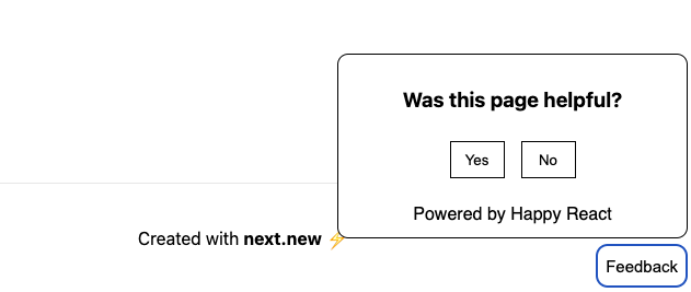
Although, the Next application doesn't necessarily need a static feedback widget. It's better to add a "Feedback" button in the corner of the page. So let's refactor a little bit our feedback component:
import React, { useState } from 'react';
import { Widget } from '@happyreact/react';

import styles from './Feedback.module.css';

import '@happyreact/react/theme.css';

const VotedYes = () => {
  return <span>Thanks for your feedback. We are glad you like it :)</span>;
};

const VotedNo = () => {
  return <span>Thanks for your feedback. We will try to improve :(</span>;
};

export default function Feedback({ resource }) {
  const [reaction, setReaction] = useState(null);
  const [isVisible, setIsVisible] = useState(false);

  const isReacted = reaction === 'Yes' || reaction === 'No';
  const _resource = String(resource).replace(/\//g, '-');

  const handleReaction = (params) => {
    setReaction(params.icon);
  };

  return (
    <div className={styles.container}>
      <div className={styles.content + ` ${isVisible && styles.visible}`}>
        {!isReacted ? (
          <div>
            <h3 className={styles.title}>Was this page helpful?</h3>
            <Widget
              token="[token]"
              resource={_resource}
              onReaction={handleReaction}
            />
          </div>
        ) : reaction === 'No' ? (
          <VotedNo />
        ) : (
          <VotedYes />
        )}
      </div>
      <button
        onClick={() => setIsVisible(!isVisible)}
        className={styles.button + ` ${isVisible && styles.active}`}
      >
        Feedback
      </button>
    </div>
  );
}
Now let's make our styles component. For now we just focused on display whole floating widget thing:
.container {
  position: fixed;
  bottom: 4px;
  right: 4px;
  transition: color 0.15s ease, border-color 0.15s ease;
}

.content {
  position: absolute;
  bottom: 45px;
  right: 0;
  background: #fff;
  border: #000 1px solid;
  padding: 12px;
  visibility: hidden;
  border-radius: 10px;
  min-width: 320px;
}

.visible {
  visibility: visible;
}

.button {
  height: 40px;
  background: #fff;
  border: #eaeaea 1px solid;
  padding: 8px;
  border-radius: 10px;
  cursor: pointer;
  font-size: 15px;
}

.button:hover {
  border-color: #0070f3;
}

.active {
  border: #000 1px solid;
}

.title {
  text-align: center;
}
Add widget styling
Now let's add some CSS to style our feedback component. We can apply styling to every part of widget.
Use classes prop for that:
import React, { useState } from 'react';
import { Widget } from '@happyreact/react';

import styles from './Feedback.module.css';

import '@happyreact/react/theme.css';

const VotedYes = () => {
  return <span>Thanks for your feedback. We are glad you like it :)</span>;
};

const VotedNo = () => {
  return <span>Thanks for your feedback. We will try to improve :(</span>;
};

export default function Feedback({ resource }) {
  const [reaction, setReaction] = useState(null);
  const [isVisible, setIsVisible] = useState(false);

  const isReacted = reaction === 'Yes' || reaction === 'No';
  const _resource = String(resource).replace(/\//g, '-');

  const handleReaction = (params) => {
    setReaction(params.icon);
  };

  return (
    <div className={styles.container}>
      <div className={styles.content + ` ${isVisible && styles.visible}`}>
        {!isReacted ? (
          <div>
            <h3 className={styles.title}>Was this page helpful?</h3>
            <Widget
              token="[token]"
              resource={_resource}
              onReaction={handleReaction}
              classes={{
                root: styles.widget,
                grid: styles.grid,
                cell: styles.cell,
                reaction: styles.reaction
              }}
            />
          </div>
        ) : reaction === 'No' ? (
          <VotedNo />
        ) : (
          <VotedYes />
        )}
      </div>
      <button
        onClick={() => setIsVisible(!isVisible)}
        className={styles.button + ` ${isVisible && styles.active}`}
      >
        Feedback
      </button>
    </div>
  );
}Make sure you replace [token] with created project token
And then final /components/Feedback.module.css file:
.container {
  position: fixed;
  bottom: 4px;
  right: 4px;
  transition: color 0.15s ease, border-color 0.15s ease;
}

.content {
  position: absolute;
  bottom: 45px;
  right: 0;
  background: #fff;
  border: #000 1px solid;
  padding: 12px;
  visibility: hidden;
  border-radius: 10px;
  min-width: 320px;
}

.visible {
  visibility: visible;
}

.button {
  height: 40px;
  background: #fff;
  border: #eaeaea 1px solid;
  padding: 8px;
  border-radius: 10px;
  cursor: pointer;
  font-size: 15px;
}

.button:hover {
  border-color: #0070f3;
}

.active {
  border: #000 1px solid;
}

.title {
  text-align: center;
}

.widget .grid {
  display: flex;
  flex-direction: row;
  justify-content: center;
  min-height: 50px;
  margin-bottom: 16px;
}

.widget .cell {
  width: 50px;
}

.widget .reaction {
  width: 100%;
  border: black 1px solid;
}

.widget .reaction:hover {
  border: black 1px solid;
}

.widget .footer {
  margin-top: 10px;
  margin-left: 0;
}
Congrats 🥳 You made it and you should see final result: