Integrating with Docusaurus
Using React package (recommended)
Install docusaurus
According to official documentation (opens in a new tab) of installing docusaurus run following methond:
npx create-docusaurus@latest my-website classicto start your project run following command:
cd my-websiteand then run:
npx docusaurus startInstall package
HappyReact provides React package to install from the npm registry. This will let you add more control over how you load the feedback widget. For example, you can defer loading it to have a better web vitals score.
npm install @happyreact/react Project setup
Create a new project in the dashboard
Go to New project (opens in a new tab) and choose the name of the project eg. Docusaurus. You can always change it later.
Add two reactions: "Yes" and "No"
Go to the Docusaurus project > Reactions tab. Click in "+ Add new reaction" and fill the "Icon" input with Yes.
Remove $count text from the "Label" input.
After that, make same steps with No reaction.
Adjust project settings
Every domain where you will use the feedback widget needs to be on the whitelist. This applies also to development and staging
domains. Make sure you include port in localhost domain eg. http://localhost:3000.
Mark the option "Allow multiple reactions" and set the "Max reactions" to 0 in settings.
Customize Docusaurus Footer
We want to include feedback on every documentation page. One solution is to attach it to every page. But Docusaurus offers us swizzling (opens in a new tab). Swizzling is ejecting part of the layout and we can customize it. So we need to eject and attach the feedback widget to the footer component.
First, we need to eject DocItemFooter using Swizzle. Run the swizzle command:
npm run swizzleThen, choose @docusaurus/theme-classic, and from a dropdown list pick DocItem/Footer.
After that, you should see two options. Eject and Wrap - choose Eject.
At the end confirm that you want to eject an unsafe component.
After this operation, we should have DocItemFooter in src/theme directory.
From now on, Docusaurus will be importing this component instead original one.
Next, we need to create our Feedback component and attach it to DocItemFooter.
import React from 'react';

export default function Feedback({ resource }) {
  return <div>Our feedback component for page {resource}</div>;
}
Then we need to use this component in:
import React from 'react';

[...]

import Feedback from '../../components/Feedback';
export default function DocItemFooter(props) {

[...]

  const {
    editUrl,
    lastUpdatedAt,
    formattedLastUpdatedAt,
    lastUpdatedBy,
    tags,
    unversionedId, // You need to get current page id
  } = metadata;

[...]

return (
    <>
      <Feedback resource={unversionedId} />
      <footer
        className={clsx(ThemeClassNames.docs.docFooter, 'docusaurus-mt-lg')}
      >
        {canDisplayTagsRow && <TagsRow tags={tags} />}
        {canDisplayEditMetaRow && (
          <EditMetaRow
            editUrl={editUrl}
            lastUpdatedAt={lastUpdatedAt}
            lastUpdatedBy={lastUpdatedBy}
            formattedLastUpdatedAt={formattedLastUpdatedAt}
          />
        )}
      </footer>
    </>
  );
}unversionedId- it's an id of your documentation page
This is a result of our changes:
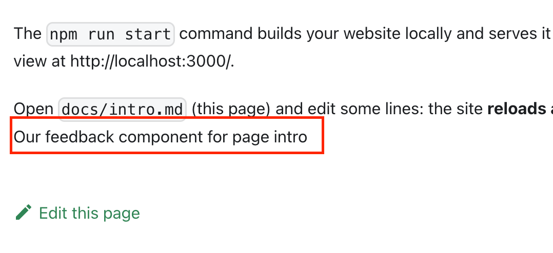
Let's make our feedback component
Now we need to adjust our Feedback code:
import React, { useState } from 'react';
import { Widget } from '@happyreact/react';

import '@happyreact/react/theme.css';

const VotedYes = () => {
  return <span>Thanks for your feedback. We are glad you like it :)</span>;
};

const VotedNo = () => {
  return <span>Thanks for your feedback. We will try to improve :(</span>;
};

export default function Feedback({ resource }) {
  const [reaction, setReaction] = useState(null);

  const isReacted = reaction === 'Yes' || reaction === 'No';
  const _resource = String(resource).replace(/\//g, '-');

  const handleReaction = (params) => {
    setReaction(params.icon);
  };

  return (
    <div>
      <h3>Was this page helpful?</h3>
      {!isReacted ? (
        <div>
          <Widget
            token="[token]"
            resource={_resource}
            onReaction={handleReaction}
          />
        </div>
      ) : reaction === 'No' ? (
        <VotedNo />
      ) : (
        <VotedYes />
      )}
    </div>
  );
}Make sure you replace [token] with created project token
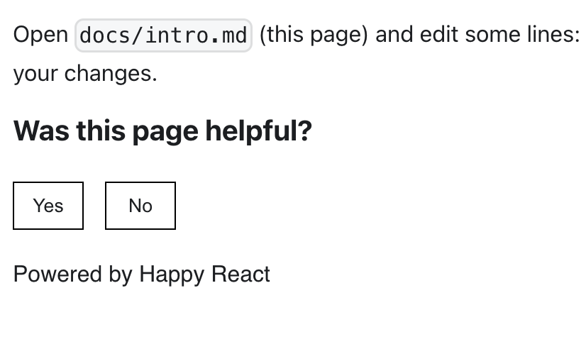
The result, for now, should be this:
Add some styling
Now let's add some CSS to style our feedback component. We can apply styling to every part of widget.
Use classes prop for that:
import React, { useState } from 'react';
import { Widget } from '@happyreact/react';

import styles from './styles.module.css';

import '@happyreact/react/theme.css';

[...]

export default function Feedback({ resource }) {

  [...]

  return (
    <div className={styles.root}>
      <h3 className={styles.title}>Was this page helpful?</h3>
      {!isReacted ? (
        <div className="">
          <Widget
            token="[token]"
            resource={_resource}
            classes={{
              root: styles.widget,
              container: styles.container,
              grid: styles.grid,
              cell: styles.cell,
              reaction: styles.reaction,
            }}
            onReaction={handleReaction}
          />
        </div>
      ) : reaction === 'No' ? (
        <VotedNo />
      ) : (
        <VotedYes />
      )}
    </div>
  );
}
And then create styles.module.css:
.root {
margin-top: 15px;
}
.title {
text-align: center;
}
.widget .grid {
display: flex;
flex-direction: row;
justify-content: center;
min-height: 50px;
}
.widget .cell {
width: 50px;
}
.widget .reaction {
width: 100%;
border: black 1px solid;
}
.widget .reaction:hover {
border: black 1px solid;
}
.widget .footer {
margin-top: 10px;
margin-left: 0;
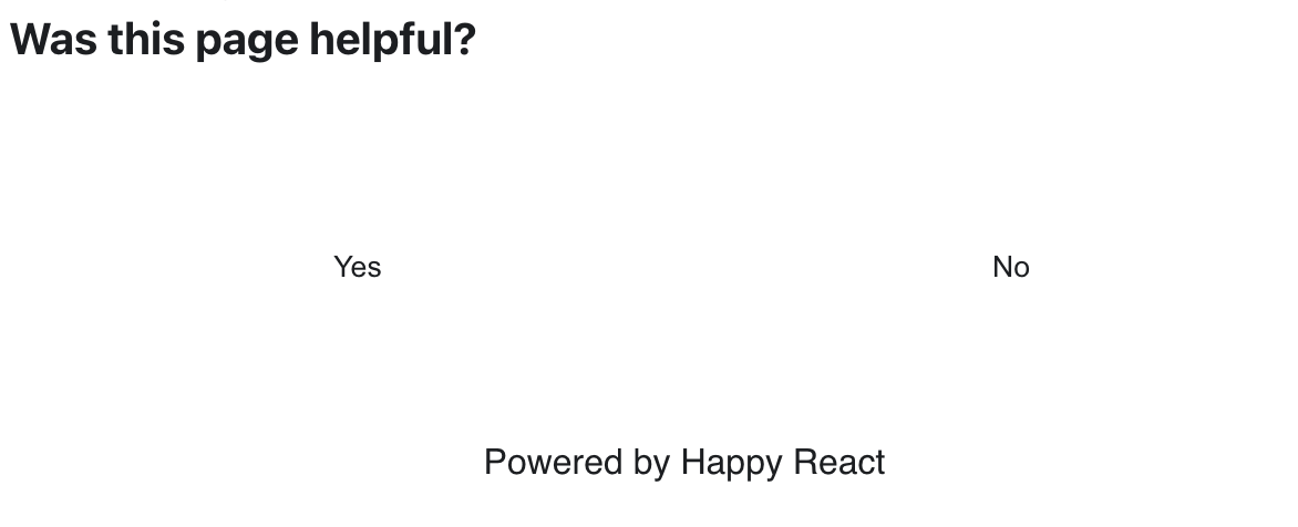
}Congrats 🥳 You made it and you should see final result:

Live example
Using JavaScript SDK (legacy)
Using JavaScript SDK in React can have many unexpected side effects like: - slower time to be usable - spawning multiple feedback widget instances - not working with React client loading
To start you need to have a Happy React account and created a project to use it with your documentation page. You can see more about how to create a new project in Happy React docs.
First, we need to add the Happy React widget script to the docusaurus config. This will let us import this script to every page.
// docusaursus.config.js
const config = {
  title: 'My Site',
  [...]
  scripts: [
    {
      src: 'https://app.happyreact.com/widget/reactions.js',
      defer: true,
    },
  ],
  [...]
}
How to set up the project:
- Create a new project in the dashboard
- Add two reactions: "Yes" and "No"
- Make "Label" empty for both
- Add domains to whitelist in settings
- Check the option "Allow multiple reactions" and set the reactions limit to
0this lets users pick multiple options over time
Lastly, add styles.module.css file in the src/components/Feedback directory.
This will be used later to add styling.
Finally, we can add feedback widget markup:
import React, { useEffect } from 'react';
import ExecutionEnvironment from '@docusaurus/ExecutionEnvironment';
import styles from './styles.module.css';

export default function Feedback({ resource }) {
  if (!ExecutionEnvironment.canUseDOM) {
    return null;
  }

  useEffect(() => {
    window.HappyReact.init();
  }, []);

  return (
    <div className={styles.root}>
      <h3 className={styles.title}>Was this page helpful?</h3>
      <div
        className={styles.widget}
        data-hr-token="<token>"
        data-hr-resource={resource}
      />
    </div>
  );
}
You should see something similar to this:
It ain't pretty but it's doing the thing. You can now choose the "Yes" or "No" option and you get. Check in the dashboard project if your click is recorded!
Next, we need to add styles. Here is a comprehensive documentation page about Happy React styling.
// src/components/Feedback/index.js

<div
  className={styles.widget}
  data-hr-token="df5f1e76-4753-4eb6-8c73-69aebf7997d0"
  data-hr-resource={resource}
  data-hr-styles={JSON.stringify({
    container: styles.container,
    grid: styles.grid,
    cell: styles.cell,
    reaction: styles.reaction,
    footer: styles.footer
  })}
/>
This will let us add styles to parts of the widget so we can style them. Then we need to create classes.
Here are example classes:
/* src/components/Feedback/styles.module.css */

.widget .grid {
  display: flex;
  flex-direction: row;
  justify-content: flex-start;
  min-height: 50px;
}
.widget .cell {
  width: 50px;
}
.widget .reaction {
  width: 100%;
  border: black 1px solid;
}
.widget .reaction:hover {
  border: black 1px solid;
}
.widget .footer {
  margin-top: 10px;
  margin-left: 0;
}
And the result of applying them is as follows: