Integrating with Nuxt (Docus)
Install Docus
According to official documentation (opens in a new tab) of installing docus is by running following command:
npx nuxi@latest init docs -t themes/docusthen go to docs directory and use your favorite package manager to install dependencies:
npm installNext, you need to run the following command to start Docus in your project:
npm run devNow you are ready to start with adding Happy React feedback widget.
Install package
HappyReact provides Vue package to install from the npm registry. This will let you add more control over how you load the feedback widget. For example, you can defer loading it to have a better web vitals score.
npm install @happyreact/vue Project setup
Create a new project in the dashboard
Go to New project (opens in a new tab) and choose the name of the project eg. Docusaurus. You can always change it later.
Add two reactions: "Yes" and "No"
Go to the Docusaurus project > Reactions tab. Click in "+ Add new reaction" and fill the "Icon" input with Yes.
Remove $count text from the "Label" input.
After that, make same steps with No reaction.
Adjust project settings
Every domain where you will use the feedback widget needs to be on the whitelist. This applies also to development and staging
domains. Make sure you include port in localhost domain eg. http://localhost:3000.
Mark the option "Allow multiple reactions" and set the "Max reactions" to 0 in settings.
Let's make our feedback component
Now we need to adjust our Feedback code:
<script setup>
import { reactive } from 'vue';
import { Widget } from '@happyreact/vue';
import '@happyreact/vue/theme.css';

const props = defineProps(['resource']);
const state = reactive({ reaction: null });

function handleReaction(params) {
  state.reaction = params.icon;
}
</script>

<template>
  <h3>Was this page helpful?</h3>
  <div v-if="state.reaction">
    <span v-if="state.reaction === 'Yes'">
      Thanks for your feedback. We are glad you like it :)
    </span>
    <span v-else> Thanks for your feedback. We will try to improve :( </span>
  </div>
  <Widget
    v-else
    token="[token]"
    :resource="props.resource"
    :onReaction="handleReaction"
  />
</template>Make sure you replace [token] with created project token
Let's change nuxt config so we are including Feedback gloablly, and we can use it in
documentation pages.
export default defineNuxtConfig({
  extends: '@nuxt-themes/docus',
  components: ['~/components/content'],
});
Add our created feedback component on the bottom of every page. Unlike, for example in docusaurus you need to manually add component at every documentation page.
# Get started

Let's get started with Docus.

# Welcome to Docus

Your new favorite way to build **documentation**.

## How to use Docus ?

Learn more on [docus.dev](https://docus.dev).

::feedback{resource="guide"}
::component{prop="value"} is special MDC Syntax (opens in a new tab) used by Nuxt Content.
It's rendering our Feedback component.
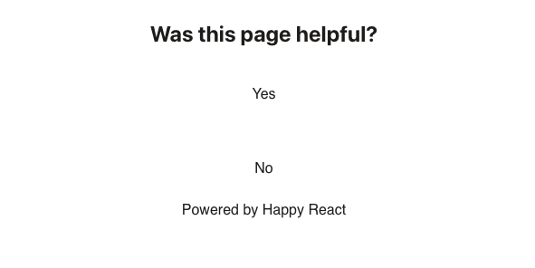
The result, for now, should be this:
Now let's make our styles component. Add this inside Feedback.vue file at the bottom of the file.
CSS should be placed between <style></style> tags.
.title {
  font-size: 24px;
  font-weight: bold;
  text-align: center;
  margin-bottom: 15px;
}

.hr-grid {
  display: flex;
  flex-direction: row;
  justify-content: center;
  min-height: 50px;
}

.hr-cell {
  width: 50px;
}

.hr-reaction {
  width: 100%;
  border: black 1px solid;
}

.hr-reaction:hover {
  border: black 1px solid;
}
Congrats 🥳 You made it and you should see final result: