Styling guide
This doc item is outdated. Check classes to know how to style HappyReact feedback widget.
You can use classes or css variables to manipulate widget styling.
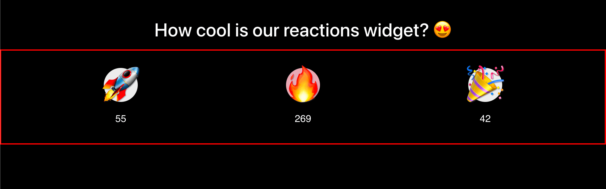
Container
.hr-container
Supported CSS variables:
-
--hr-container-color- change container csscolorproperty -
--hr-container-background- change container cssbackgroundproperty
Example:
.my-widget {
  --hr-container-color: skyblue;
}
or
.my-widget .hr-container {
color: skyblue;
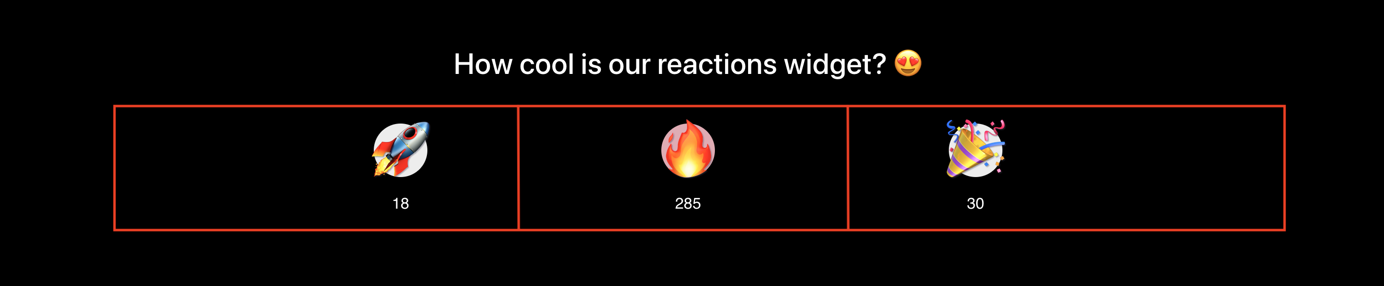
}Grid
.hr-grid
Supported CSS variables:
-
--hr-grid-color- change grid csscolorproperty -
--hr-grid-background- change grid cssbackgroundproperty -
--hr-grid-gap- (default: 15px) change grid cssgapproperty used to space grid items
Example:
.my-widget {
  --hr-grid-gap: 20px;
}
or
.my-widget .hr-grid {
  gap: 20px;
}
Cell
.hr-cell

Supported CSS variables:
-
--hr-cell-color- change cell csscolorproperty -
--hr-cell-background- change cell cssbackgroundproperty
Example:
.my-widget {
  --hr-cell-background: ultraviolet;
}
or
.my-widget .hr-cell {
  background: ultraviolet;
}
Reaction
.hr-reaction

Supported CSS variables:
-
--hr-reaction-color- change reaction csscolorproperty -
--hr-reaction-background- change reaction cssbackgroundproperty -
--hr-reaction-border- change reaction cssborderproperty -
--hr-reaction-border-radius- change reaction cssborder-radiusproperty
Example:
.my-widget {
  --hr-reaction-border-radius: 50%;
}
or
.my-widget .hr-reaction {
  border-radius: 50%;
}
Reaction (hover)
.hr-reaction:hover
Supported CSS variables:
-
--hr-reaction-hover-color- change reaction csscolorproperty when its state is hovered -
--hr-reaction-hover-background- change reaction cssbackgroundproperty when its state is hovered -
--hr-reaction-hover-border- change reaction cssborderproperty when its state is hovered -
--hr-reaction-hover-border-radius- change reaction cssborder-radiusproperty when its state is hovered
Example:
.my-widget {
  --hr-reaction-hover-border-radius: 50%;
}
or
.my-widget .hr-reaction:hover {
  border-radius: 50%;
}
Reaction (active)
.hr-reaction:active / .hr-reaction-active

Supported CSS variables:
-
--hr-reaction-active-color- change reaction csscolorproperty when its state is active -
--hr-reaction-active-background- change reaction cssbackgroundproperty when its state is active -
--hr-reaction-active-border- change reaction cssborderproperty when its state is active -
--hr-reaction-active-border-radius- change reaction cssborder-radiusproperty when its state is active
Example:
.my-widget {
  --hr-reaction-active-border: 2px dotted skyblue;
}
or
.my-widget .hr-reaction:active,
.my-widget .hr-reaction-active {
  border: 2px dotted skyblue;
}