Quick start: 3 minutes tutorial
Before you start, make sure you follow Get Started. At this point, you need the project with all setups you would like to make.
Place reactions widget on your website
Add widget where you want to place it on your website. Pass <token> from your project and
meaningful resource name in <title> place. Resource should be unique for every page.
<div data-hr-token="<token>" data-hr-resource="<title>"></div>Decorate your widget with heading and class that will be used to change the style of the widget.
💡
Provide meaningful resource name to distinguish them in dashboard.
Add script
Inject script just before body closing tag.
<script src="https://app.happyreact.com/widget/reactions.js" defer></script>Remember to add defer keyword to the script tag.
Add styles
Now you just need to add styling to your widget. You can be creative!
With sample code as below:
@media (prefers-color-scheme: light) {
.post__reactions {
--reaction-color: 214, 214, 214;
--reaction-accent: 0, 116, 217;
}
}
@media (prefers-color-scheme: dark) {
.post__reactions {
--reaction-color: 237, 237, 237;
--reaction-accent: 102, 186, 255;
}
}
.post__reactions {
min-height: 200px;
--reaction-shadow-color: rgba(66, 68, 90, 0.2);
}
.post__reactions .hr-reaction {
font-size: 16px;
}
.post__reactions .hr-reaction-icon {
height: 50px;
width: 50px;
border-radius: 50%;
transition: all 275ms linear;
text-shadow: 1px 1px 1px var(--reaction-shadow-color);
background-color: rgb(var(--reaction-color));
box-shadow: 0px 0px 0px 2px rgba(var(--reaction-color), 0.1), 0px 0px 0px 5px
rgba(var(--reaction-color), 0.3),
0px 0px 0px 7px rgba(var(--reaction-color), 0.1);
}
.post__reactions .hr-reaction:hover .hr-reaction-icon {
border-radius: 50%;
background-color: rgb(var(--reaction-color));
box-shadow: 0 0 15px rgba(var(--reaction-color), 0.8), 0 0 15px rgba(var(--reaction-color), 0.6);
}
.post__reactions .hr-reaction-active .hr-reaction-icon {
border-radius: 50%;
background-color: rgb(var(--reaction-accent));
box-shadow: 0px 0px 0px 2px rgba(var(--reaction-accent), 0.06), 0px 0px 0px
5px rgba(var(--reaction-accent), 0.2),
0px 0px 0px 7px rgba(var(--reaction-accent), 0.05);
}
.post__reactions .hr-reaction-active:hover .hr-reaction-icon {
border-radius: 50%;
background-color: rgb(var(--reaction-accent));
box-shadow: 0 0 15px rgba(var(--reaction-accent), 0.6), 0 0 15px rgba(var(--reaction-accent), 0.5);
}
.post__reactions .hr-reaction .hr-reaction-text {
margin-top: 15px;
}
.post__reactions .hr-reaction-active .hr-reaction-text {
font-weight: bold;
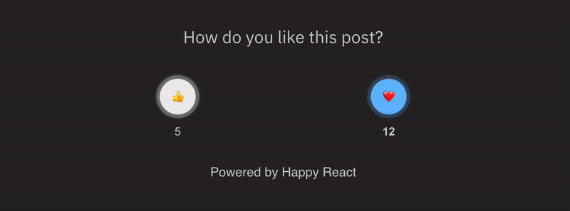
}You can get this result
Read more about styling to see what you can acheive.